Creating an interactive physical artifact to raise awareness about the impact of wildfires on the West Coast of the USA
Tools Used: Arduino, GIMP, Excel, Laser Cutter
Timeline: Oct 2023 - Dec 2023.
My role: Co-designer and Developer
Background
In today’s world, we exist in what can be called a “Datapolis,” where our lives are deeply intertwined with data. Traditionally, data is perceived as something inherently digital—a concept that often limits its potential for meaningful engagement. However, this stereotype can be challenged by exploring alternative, physical representations of data. Historically, civilizations like the Incas used material objects, such as knot patterns and cord twist directions, as sophisticated tools for data storage and communication. Similarly, in the modern context, data should not be confined to abstract graphs and tables. Instead, it can be transformed into physical forms that can convey urgency, evoke emotions, and create impactful meanings. Making the data more accessible and understandable to a broader audience in the major goal of this project.
Define the Problem
Having lived on the West Coast of the US, my teammate and I have seen the devastating rise in wildfires due to climate change. These fires not only destroy natural landscapes but also pose serious health risks, especially to vulnerable groups like the elderly and children. Despite their impact, wildfire data is often presented in ways that fail to capture the urgency and emotional toll, making it harder for people to grasp the true scale of the problem.
Goal
Transform wildfire data into an engaging physical display to make it more accessible and impactful.
Ideation
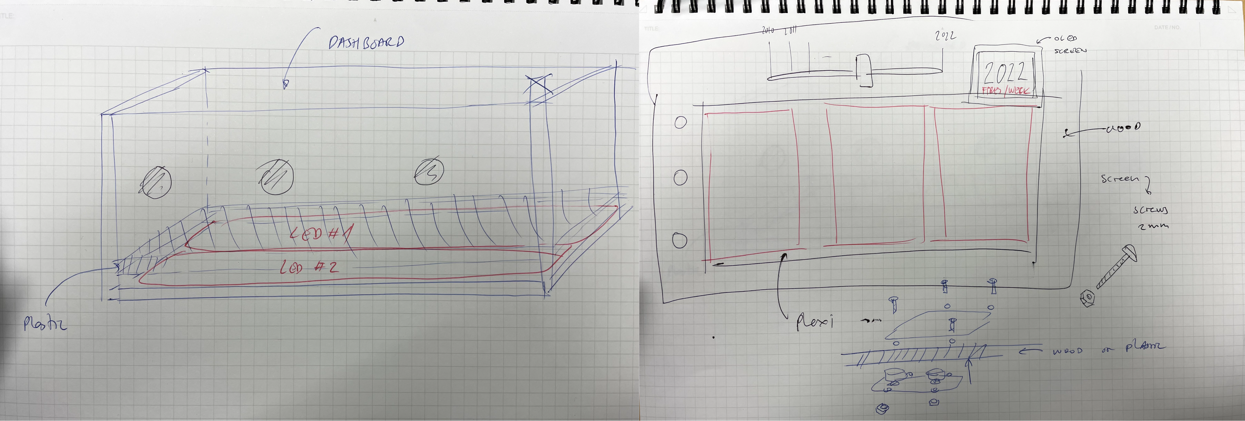
We kicked off the project by conceptualizing a physical artifact to visualize wildfire data using LED lights and acrylic panels, with sketches as early prototypes.
Data Selection & Analysis
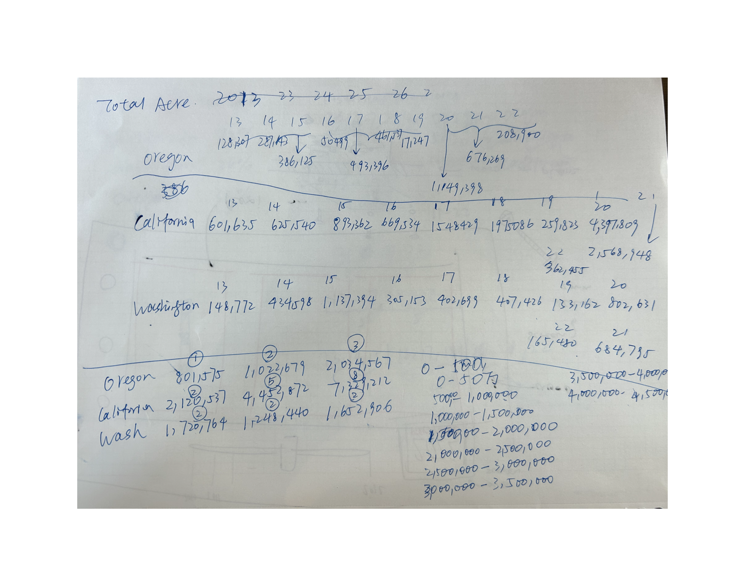
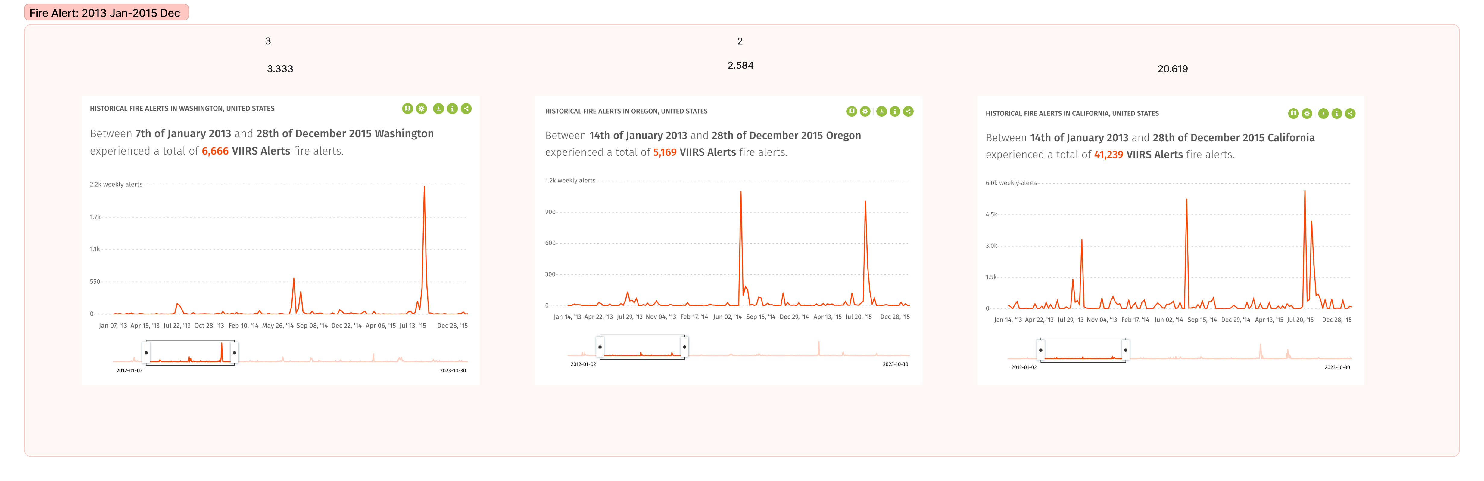
After deciding the project scope, we selected relevant wildfire data (2013-2022) from Global Forest Watch website in Washington, Oregon, and California, and processed data for display on a comparable scale.
Design & Development
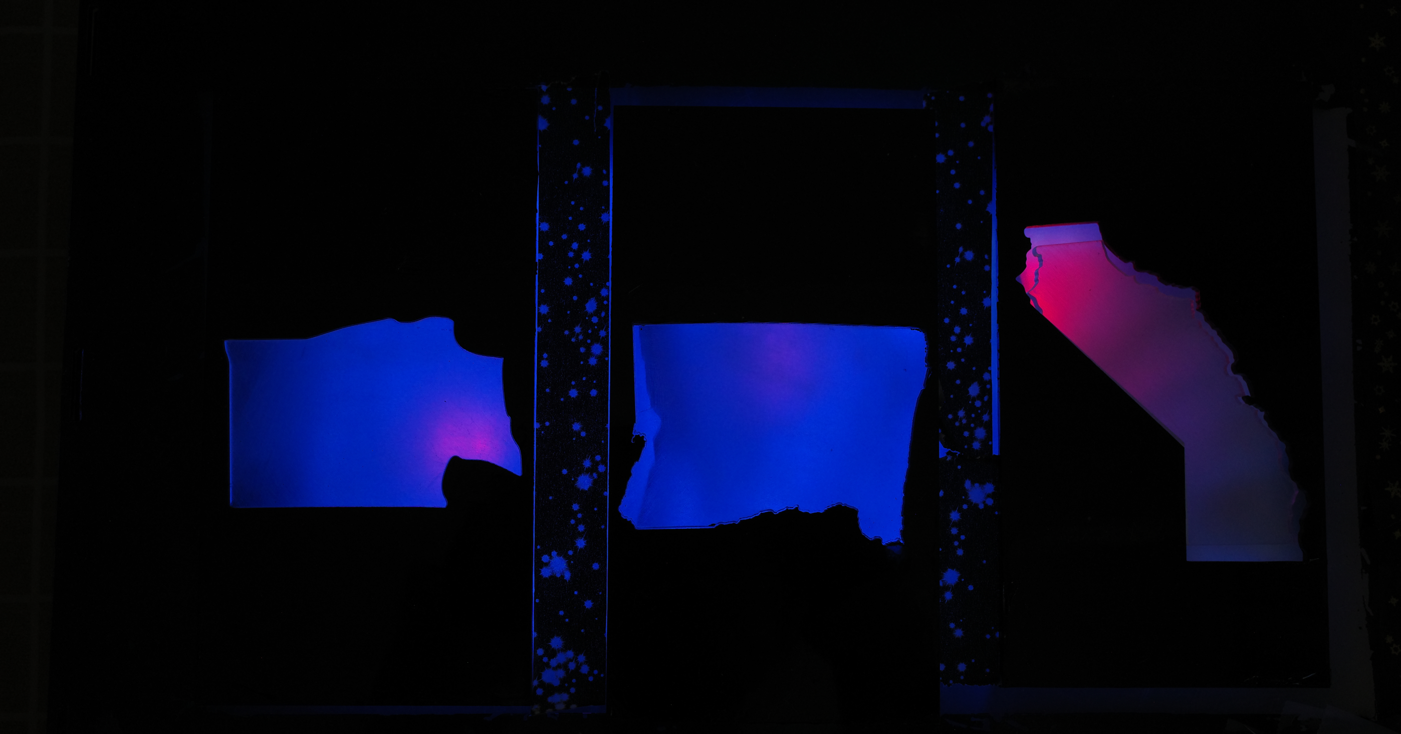
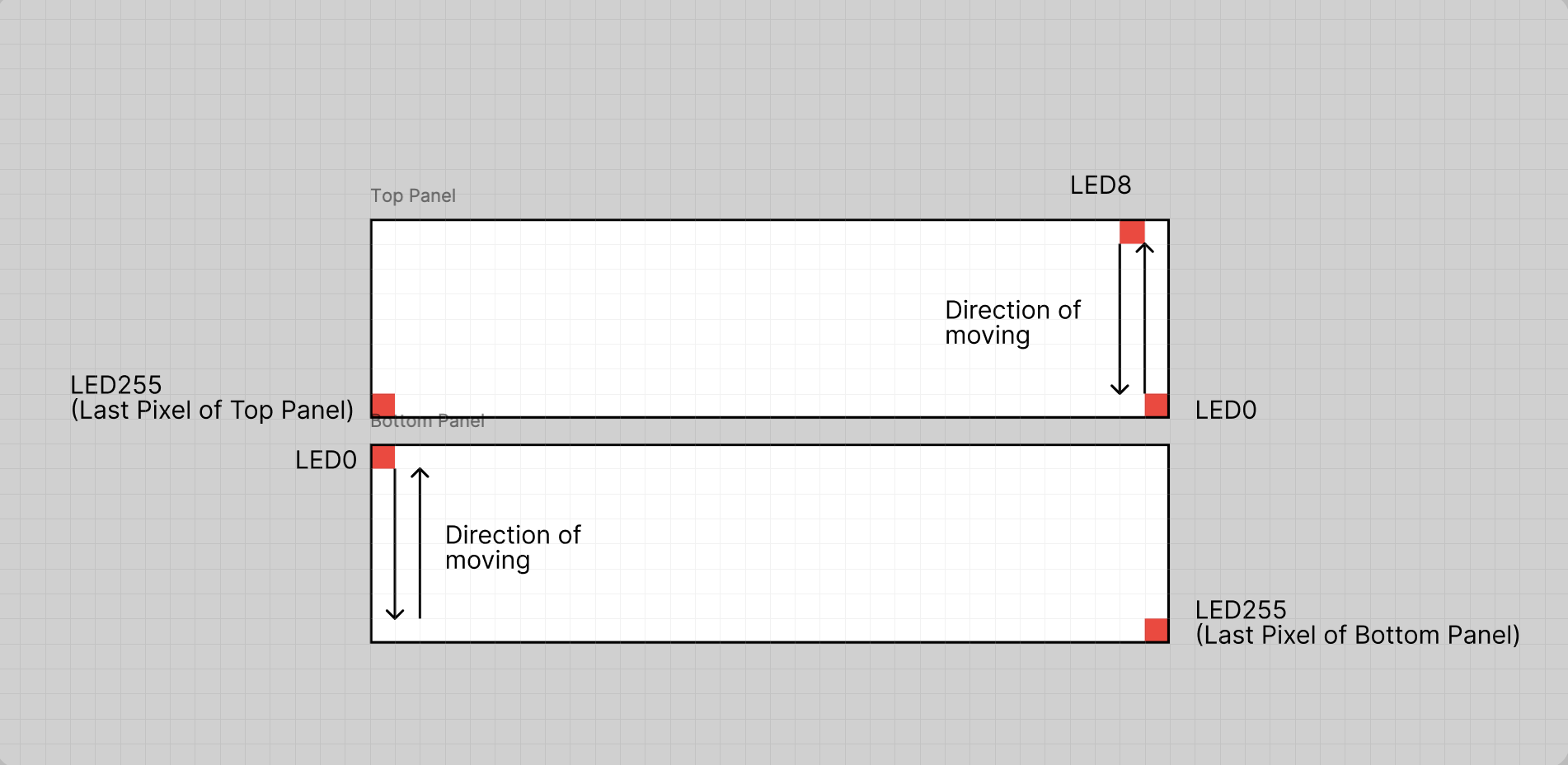
We created GIF animations to represent different data scales across the three states. The interactive artifact is powered by an Arduino board, LED panels, a sliding bar for controlling the time period, three buttons to control the on/off status of each state, and laser-cut acrylic shaped like the West Coast states. To ensure the lights spread evenly, we also added cotton inside the chamber above the LED panels.


Outcome
Our physical artifact illuatrate an interactive, visual, and tactile representation of wildfire data, allowing users to explore the impact across different states and time periods.
Reflection
This project taught me the critical role of interactivity and physicalization in data presentation. I learned that transforming data into a tactile and visual experience can enhance user engagement and understanding, making complex information more accessible. Throughout the development process, I also gained valuable experience in troubleshooting technical challenges, particularly in designing the LED displays and coding in an unfamiliar programming language (C++) to make the prototype functional.